The most common reason a website redesign drags on isn't the code — it's that brand decisions get made during design instead of before it. Every "actually, can we try a different color" or "wait, what's our tagline again" mid-project costs real time. Sorting these out first isn't bureaucracy, it's what lets a design phase move fast.
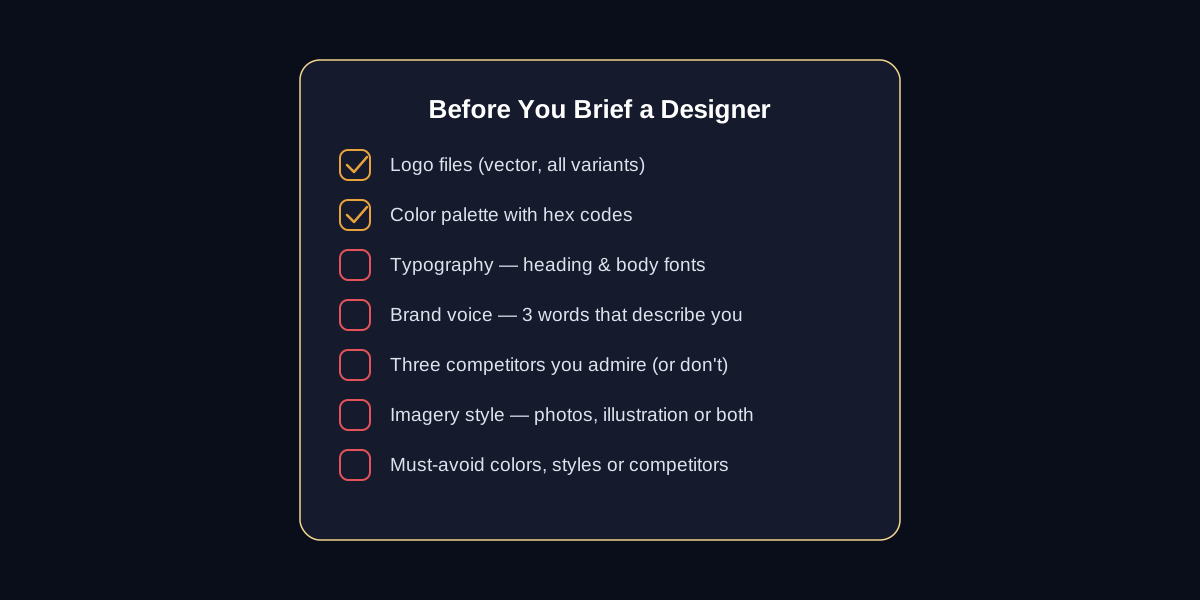
What to have ready before the first design file opens
- Logo files — vector format (SVG or AI), plus any approved variations (light, dark, icon-only)
- Color palette — exact hex codes, not "sort of blue." If you don't have these yet, that's a sign branding should come before the website, not alongside it
- Typography — a heading font and a body font. They don't need to be final, but the site shouldn't be designed around a placeholder
- Brand voice — three words that describe how you sound. "Playful and direct" reads very differently than "precise and formal," and it changes every headline on the site
- Three competitors — sites you admire, and just as usefully, ones you specifically don't want to resemble
- Imagery style — real photography, illustration, or a mix. This decision alone affects layout, so it can't be an afterthought
What happens when this step gets skipped
The symptom is always the same: the homepage looks polished, and by the fourth interior page the color usage has drifted, the heading sizes are inconsistent, and the tone swings between formal and casual depending on who wrote the copy that day. None of it looks wrong in isolation — it just doesn't look like one brand made every decision on purpose. A short checklist at the start is a lot cheaper than a consistency pass at the end.